
Our Favorite Interior Paint Colors for a Modern, Timeless Home
At River Brook Design & Construction, we believe every home should feel like a sanctuary - welcoming, enduring, and rich with layered warmth. Just as in our last blog post “Layered Neutrals: Creating Timeless Spaces with Depth & Warmth,” where neutrals are anything but simple, the colors you choose for your walls can anchor your space in both elegance and comfort.
Paint is more than aesthetic - it sets the emotional tone of each room. Warm, timeless shades offer a welcoming atmosphere while providing a backdrop that beautifully complements natural materials, bespoke furnishings, and architectural details like archways or built-ins. These hues adapt gracefully over time, ensuring your home evolves while keeping a modern feel.
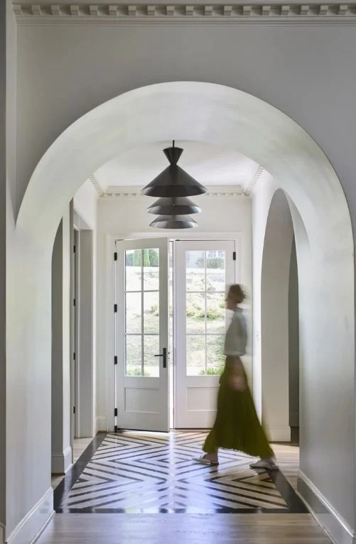
A Classic White: White Dove (OC-17) -Benjamin Moore
A River Brook favorite—as shared on their Instagram, “White Dove by Benjamin Moore is a staple for both interiors and exteriors. Its soft, warm undertones create a welcoming and timeless feel. We love to use this paint color for a variety of interior design projects. You can use it for paint across a whole home to maintain cohesion, trim and cabinetry to create contrast in color-rich rooms, or as a clean yet warm backdrop in an open area. This is one of our favorite paint colors because it feels bright without feeling sterile, offering just enough warmth to be inviting year-round.
Layered Neutrals with Depth
We are thinking beyond basic beige when it comes to modern home remodeling and custom interior design.
Consider these hues:
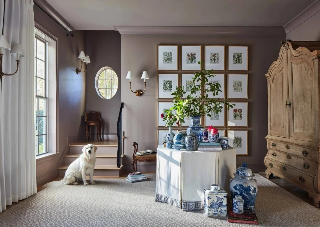
Greige: A versatile marriage of gray and beige
Sage or Muted Olive: Evokes subtle nature-inspired depth
Light Taupe: Warms a room while stasying sophisticated and classic
Some tips for layering neutrals include using a deeper shade on an architectural niche or detail, adjoining rooms with variants in color, and accenting with natural materials to amplify textures and contrast.
See our latest blog post on layering neutrals for more tips and tricks: Layered Neutrals: Creating Timeless Spaces with Depth & Warmth — Riverbook
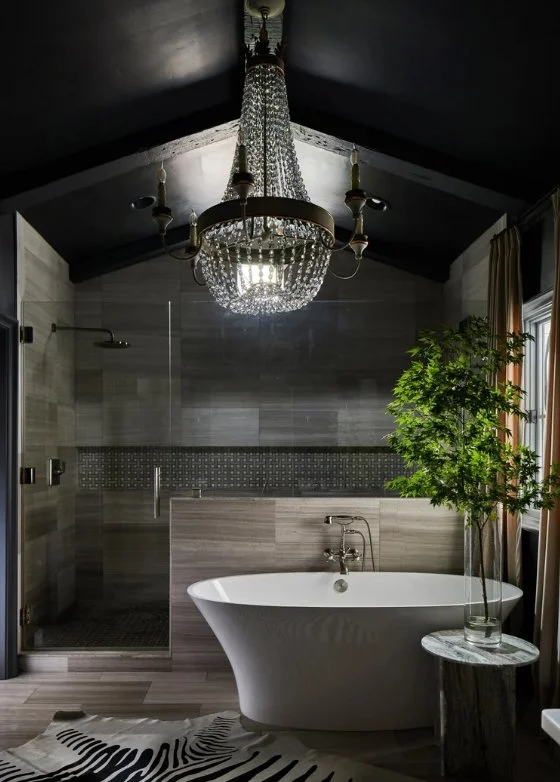

Use Deeper Accent Hues to Ground the Space
For focal points or moodier corners, we encourage richer tones - deeper, more playful hues that bring a space to life. Clay or terrracotta has an earthy and grounding appearance and could be ideal for reading nooks or a cozy dining area. Navy or charcoal accents can add drama and elegance to a media room, library, or dining room. Warm ochre, rust, or reds can add a sunlit glow to a home and is great for hallways, powder rooms, or statement cabinetry.
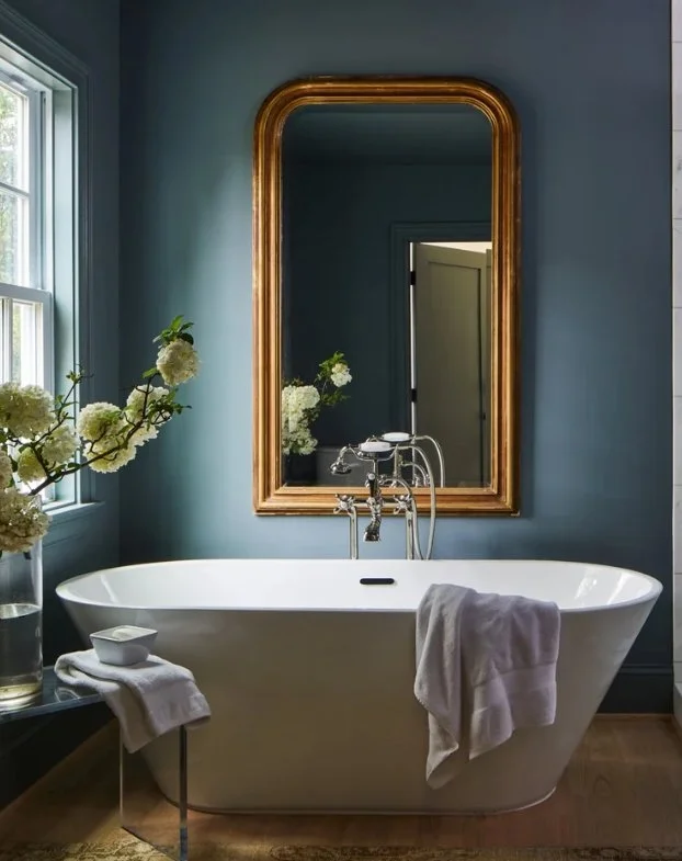
A Warm Neutral: Charleston Gray - Farrow and Ball (No. 243)
Among our most beloved warm neutrals, Farrow & Ball’s Charleston Gray stands out for its remarkable versatility and depth. Unlike cooler grays that can feel stark or sterile, Charleston Gray carries soft brown undertones that instantly add warmth and character to a space. It’s sophisticated without being severe, making it just as at home in a formal living room as it is in a cozy primary bedroom . In natural light, it takes on a rich, earthy elegance, while in the evening it deepens into a beautiful shade that feels both grounding and timeless. Paired with crisp white trim, natural woods, or layered textures like linen and wool, Charleston Gray creates a balanced, inviting backdrop that feels enduringly fresh yet comfortingly classic.
Some final Thoughts
Opting for warm, timeless paint choices - like Benjamin Moore’s White Dove, layered neutrals, and thoughtfully placed accent hues - lets your home feel both fresh and grounded. These colors are more than décor - they’re a foundation for a home that feels deeply yours and undeniably enduring. We always recommend testing samples in various lighting conditions at different times of the day to find your perfect match. Another tip is to pair matte walls with a satin trim for a balanced and tactile look. Lastly, choose hues that pair well with seasonal decor and your own evolving style.
Check out our latest blog posts: Blog — Riverbook
Want to see these paint colors in action? Click here!